Transforming Real-World Data into Actionable Insight
Real-Time Running Analysis: Tracking Performance and Progress
Overview
This analysis study leverages my Strava running data. After cleaning and examining the raw dataset using Power Query in Excel, I imported the data into Google Sheets for real-time analysis. Dashboards were then built using Looker Studio.
Data Collection and Transformation
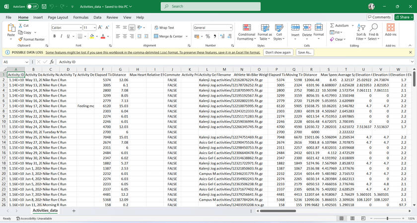
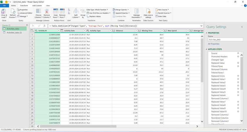
I collected raw data from Strava in CSV format and imported it into Excel via Power Query Editor. This step involved:
Removing unnecessary columns
Modifying data types and changing parameters
Converting the data into a more readable format
Finally, I loaded the cleaned dataset into Google Sheets for further analysis.
Automated Data Feed
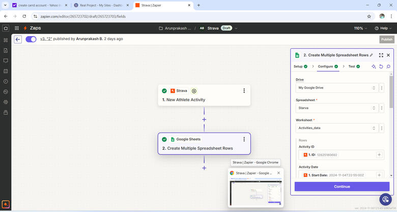
To ensure the dataset is regularly updated with new activity data, I set up an automation using Zapier. This automation pulls data from Strava and feeds it directly into Google Sheets, ensuring up-to-date information for analysis.
Data importation
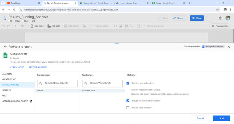
For dashboard creation, I directly linked the activity data to Google Looker Studio, enabling real-time reporting and visualization.
Calculation
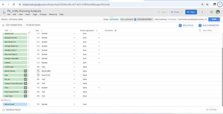
Several calculations were performed in Looker Studio to derive valuable insights, including:
Grouping the Distance column in increments of 5k and by race type to identify the minimum time for specific race distances.
Calculating Pace for each run based on distance and time.
Transforming Avg Speed and Max Speed from meters per second (m/s) to kilometers per hour (km/h).
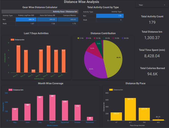
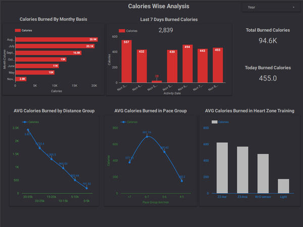
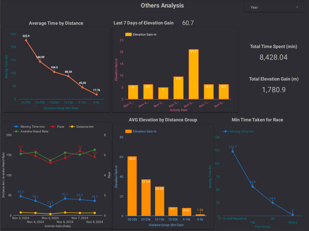
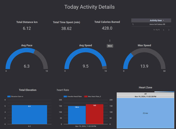
Running Analysis Dashboard
The final result is a Running Analysis Dashboard in Looker Studio, where you can explore insights such as:
Distance traveled
Calories burned
Daily Activity Analyze
Zone-wise comparisons and more.
Click the following button to see the live Dashboard
HR Data Analysis: Unlocking Insights for Workforce Optimization
Overview
This HR data analysis study focuses on transforming raw HR data into actionable insights, visualized in an interactive Tableau dashboard for easy interpretation.
Data Collection and Transformation
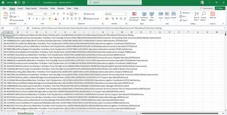
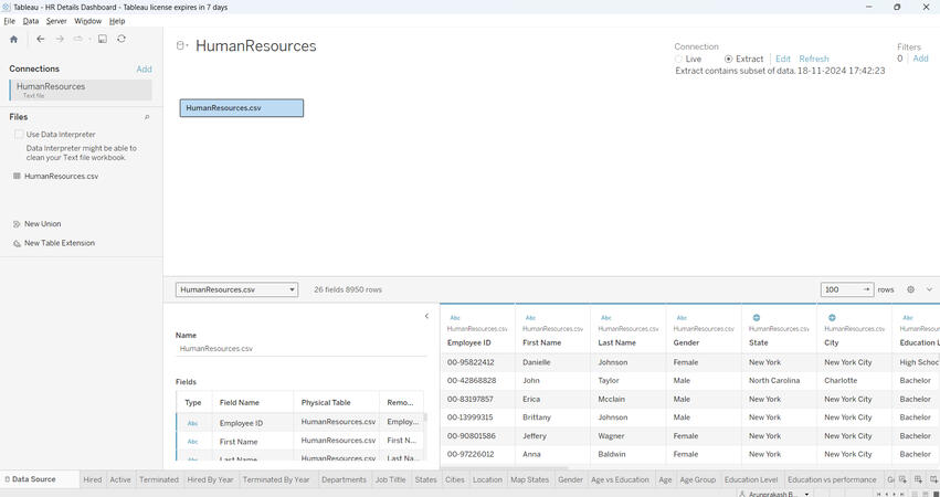
The HR data was sourced as a dummy CSV file from online platforms. It was then loaded into Tableau, where the data types were reviewed, modified as needed, and prepared for analysis (click the image to view the raw data).
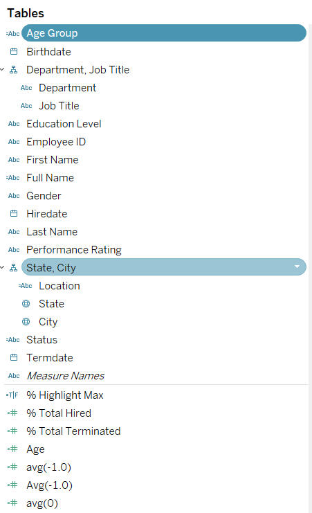
Worksheets
A total of 19 worksheets were created to analyze various aspects of the HR dataset. Each worksheet presents unique insights through different types of visualizations, such as bar charts, pie charts, heat maps, and line charts, etc... Key worksheets include:
Hired: Shows the total count of employees hired.
Active: Displays the total count of active employees.
Terminated: Shows the total count of terminated employees.
Hired By Year: Combines a line and area chart to visualize the number of employees hired by year, with the percentage of total hires displayed in the tooltip.
Terminated By Year: Combines line and area charts to show the number of employees terminated by year, with percentages of total terminations in the tooltip.
Departments: Visualizes department-wise employee hires and terminations as bar charts, with additional job title-wise employee data in the tooltip.
Job Title: Displays the count of employees hired and terminated, broken down by job title in bar chart format.
States: Shows employee hire counts by state, with city-wise data available in the tooltip.
Gender: A donut chart visualizes gender-wise employee hires and terminations as percentages, with counts shown in the tooltip.
Age Vs Education: A heat map that explores employee hires based on age group and education level.
Age: Displays employee hires based on specific age groups.
Education Level: Visualizes employee hires by education level.
Education vs Performance: Heat map visualizing the performance of employees by education level, with counts in the tooltip.
Gender Vs Education Level: A combination of line and shape charts to visualize the relationship between education level, average salary, and gender.
Age Vs Salary: Analyzes the relationship between job title, average salary, and average age.
Cities: Visualizes the count of hired employees by city.
Location: Groups employees into "HQ" and "Branch" locations, visualizing employee counts and providing state-wise data in the tooltip.
Map Status: Displays hired employee details on a map with city-wise information in the tooltip.
Click the button to see the worksheets (Note: Due to dashboard visualizations, some data labels might not be visible in individual worksheets. Check the dashboard for full details).
Calculation
Several calculated fields were created in Tableau to provide more insightful data:
Total Hired: Count of employees hired (COUNT([Employee ID])).
Total Active: Count of employees still active (COUNT(IF ISNULL([Termdate]) THEN [Employee ID] END)).
Total Terminated: Count of terminated employees (COUNT(IF NOT ISNULL([Termdate]) THEN [Employee ID] END)).
% Total Hired: The percentage of total hires ([Total Hired] / TOTAL([Total Hired])).
% Total Terminated: The percentage of total terminations ([Total Terminated] / TOTAL([Total Terminated])).
Status: Classifies employees as 'Hired' or 'Terminated' based on termination date. IF ISNULL([Termdate]) THEN 'Hired' ELSE 'Terminated' END
Full Name: Combines first and last names of employees. [First Name] + ' ' + [Last Name]
Age Group: Categorizes employees into age groups for analysis. IF [Age] < 25 THEN '<25' ELSEIF [Age] >=25 AND [Age] < 35 THEN '25-34' ELSEIF [Age] >=35 AND [Age] < 45 THEN '35-44' ELSEIF [Age] >=45 AND [Age] < 55 THEN '45-54' ELSEIF [Age] >=55 THEN '55+' END
Location: Classifies employees into 'HQ' or 'Branch' based on their state. CASE [State] WHEN 'New York' THEN 'HQ' ELSE 'Branch' END
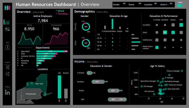
HR Analysis Dashboard
The HR Analysis Dashboard is an interactive and comprehensive Tableau dashboard that combines various visualizations to give a holistic view of employee demographics, hiring trends, terminations, and other key metrics.
HR Summary Dashboard: Contains over 12 different charts, offering insights into employee counts, age distributions, education levels, salaries, and more.
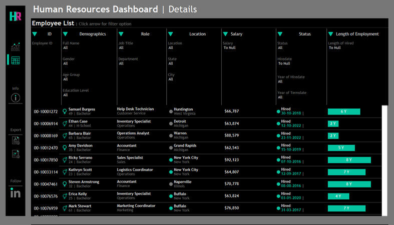
HR Details: A unique table format that allows for detailed data analysis.
Click the image to view the live Dashboard.